
A Studio Journal · Concept Work
The Making of Meridian.
One concept project, followed from a blank page to a working site — decisions, arguments, and all. No client, no brief, no committee. Just the way this studio thinks, on display.
Chapter One
It Starts With the Business, Not the Colors.
Before a single pixel, one question: what must a stranger believe in the first five seconds on this site? For a general contractor, it isn’t “we’re passionate about quality.” Everyone is passionate about quality. It’s proof — trucks at dawn, finished roofs, a phone that gets answered on the second ring.
So Meridian opens on the work. Not a mission statement, not a stock handshake. The whole homepage is an argument arranged in that order: proof first, capability second, invitation last.
What must a stranger believe?
- This crew shows up.
- This crew has done this before.
- This crew answers the phone.
everything else is decoration — earn these three first
Chapter Two
The Redline Comes First.
Designing starts with marking up what everyone else settles for. The generic contractor template — stock hero, three vague services, a testimonial that could belong to anyone — is what a stranger has seen a hundred times before yours.
This is the same treatment every Request a Redline receives. It’s easier to explain a direction when you can point at exactly what it walks away from.
Chapter Three
Structure Before Style.
Then the wireframe. No colors, no fonts, no debates about the correct shade of sage — only the order of the arguments. If the structure doesn’t work in gray, it won’t work in bronze.
Keep scrolling — you draw it yourself.
Chapter Four
A System, Not a Mood.
Color arrives last, on purpose. Charcoal for weight. Bronze for warmth. Cream for air. The red is spent on one thing only — the pencil, which never appears in a Meridian page, only in the studio’s hand.
Typography: Playfair Display carries the authority; Montserrat does the answering. And spacing does the quiet luxury work — generous margins read as confidence before anyone can name why.
Proof over promise.
And the part that answers questions.
same words, different air — spacing is a decision
Chapter Five
Then It Learns to Move.
A finished site should behave like a well-run shop: things respond when touched. Numbers count up, because momentum should read as momentum. Photos lean toward your cursor, because attention is a conversation, not a broadcast.
Nothing moves without a reason — and nothing stands still that could greet you.
projects delivered — the mechanic, demonstrated
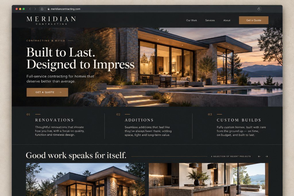
gray is a promise; color is the payoff
attention is a conversation
Chapter Six
The Honest Part.
What this page didn’t show: the client calls, the revisions, the Tuesday-night “can it pop more.” Those exist in every real engagement — this studio just doesn’t pretend otherwise.
What you did watch is the standard. Every project gets the thinking you’ve just read — the five-second test, the redline, the gray wireframe, the system, the motion. Whether it’s a concept argued in public, or your business, argued carefully in private.