Portfolio

How the Studio
Thinks.

Concept websites, before-and-after redlines, and brand identity work — every piece built to show judgment, not just output.

Every project below is a concept, clearly labeled as such. None represents paid client work, and no testimonials, results, or client relationships are implied. When real client projects are added, they will appear here alongside, or in place of, these explorations.

meridiancontracting.example
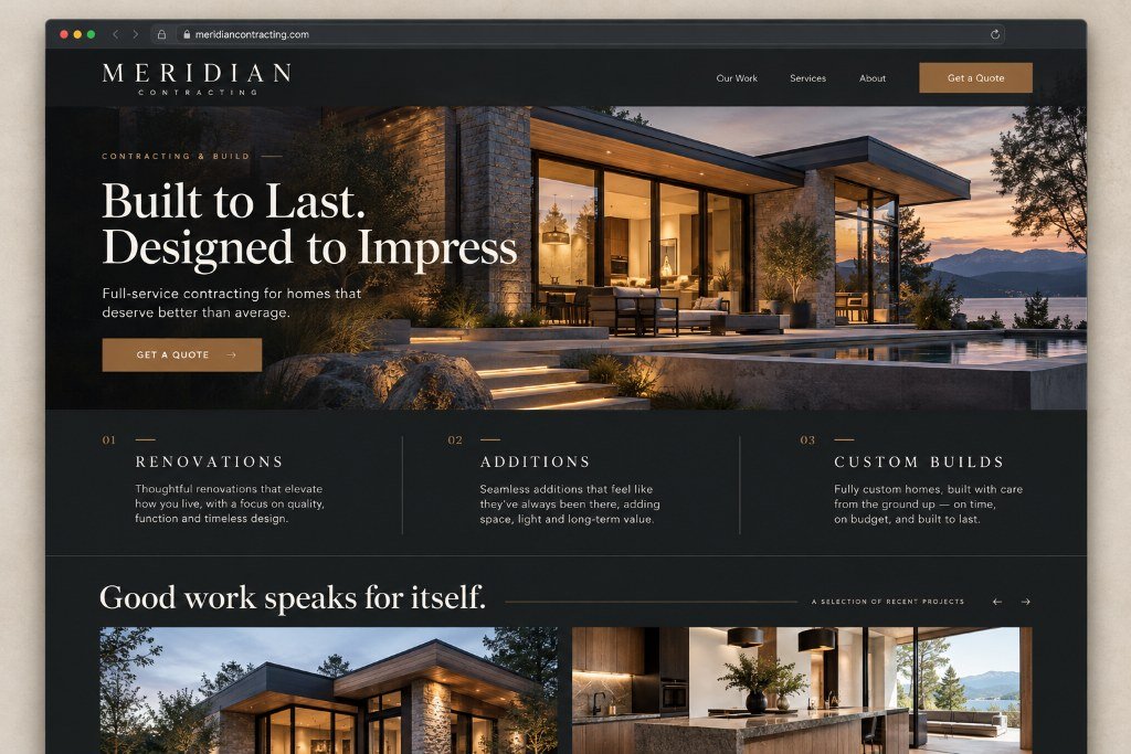
Meridian Contracting concept website, homepage preview: dark architectural hero with bronze accents
Concept Project

Contracting · Custom Design

Meridian Contracting

Contractors sell trust before they sell anything else, and trust needs room to breathe. This exploration pairs deep charcoal surfaces with warm bronze accents and gives proof-of-craft imagery the full width it deserves.

The aim: a site that feels as solid as the work behind it, with a quote path that takes three clicks, not thirty.
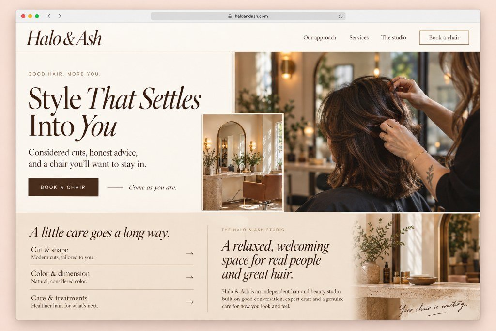
haloandash.example
Halo & Ash salon concept website, homepage preview: cream editorial hero with serif headline and salon photography
Concept Project

Salon · Identity + Website

Halo & Ash

A salon identity where warmth doesn't cancel polish: an italic serif wordmark, a cream and bronze palette, and a booking experience that feels like a conversation rather than a transaction.

The aim: proof that a beauty brand can be editorial and inviting without a single stock-photo cliche.

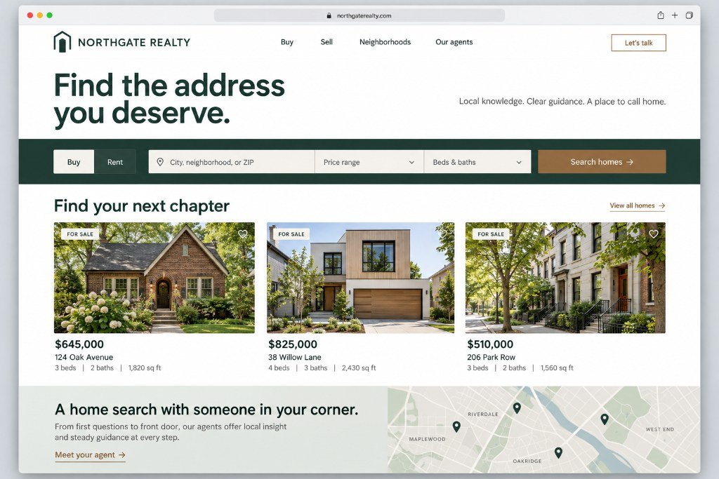
northgaterealty.example
Northgate Realty concept website, homepage preview: dark green real estate hero with property search bar and listing cards
Concept Project

Real Estate · Custom Design

Northgate Realty

Real estate sites drown in clutter. This one leads with restraint: clean grids, clear typography, and browsing hierarchy that respects how people actually look for a home at ten o'clock at night.

The aim: credibility first, listings second, and a browsing experience that never makes someone hunt for the next step.

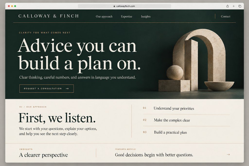
callowayfinch.example
Calloway & Finch concept website, homepage preview: dark advisory hero with serif headline and stone sculpture imagery
Concept Project

Professional Services · Custom Design

Calloway & Finch

Professional practices earn trust with precision, not flash. This exploration uses a deep green palette, generous spacing, and restrained bronze detailing to feel established without feeling stuffy.

The aim: a site that reassures a nervous first-time client before they ever reach the phone.

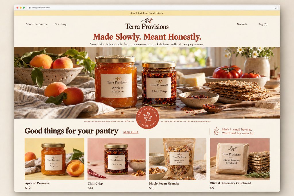
terraprovisions.example
Terra Provisions concept website, homepage preview: artisan pantry shop with preserve photography and product grid
Concept Project

Independent Entrepreneur · Identity + Website

Terra Provisions

Independent makers deserve better than marketplace profiles. This exploration gives a one-person food business a full identity: warm paper tones, honest copy, and a brand that finally matches the quality of the product.

The aim: an online home that makes a small operation feel like a destination, not a side hustle.

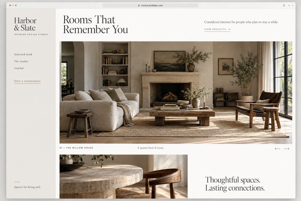
harborandslate.example
Harbor & Slate concept website, homepage preview: split interior design layout with living room photography
Concept Project

Design Studio · Custom Design

Harbor & Slate

A portfolio-led studio needs the design to disappear into the work. Muted surfaces and quiet structure let imagery lead, while the details, including a subtle bronze underline system, reward a closer look.

The aim: proof that restraint is a brand strategy, and that negative space is doing more work than it gets credit for.

The Redline

Every "Before" Gets Marked Up. Drag the Line to See the Fix.

The studio's critique treatment: the original site carries hand-drawn marks naming what doesn't work — the buried ask, the filing-cabinet navigation, the welcome mat where a promise should be. Drag the pencil line and the redesign pours in over the critique, the marks dissolving as it arrives. You watch the redline become the redesign.

Drag the line, or focus a frame and use the arrow keys. Right of the line: the after.

The Redline · No. 01

Clearline Plumbing

An emergency trade, presented like a brochure.

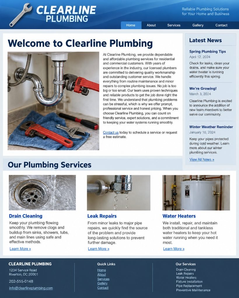
Clearline Plumbing original website, marked up with studio critique
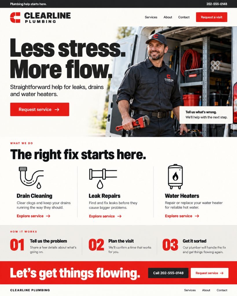
Clearline Plumbing redesigned concept

Concept exploration. The old site read like a brochure that happened to mention plumbing. The concept behaves like a plumber: the phone number leads, the fix has three steps, and the ask sits above the fold — less stress, more flow.

The Redline · No. 02

Juniper Hair Studio

A salon that asked for nothing until the footer.

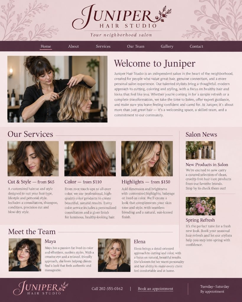
Juniper Hair Studio original website, marked up with studio critique
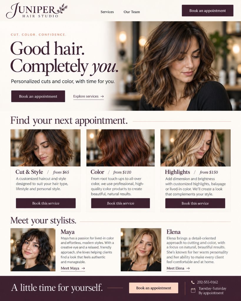
Juniper Hair Studio redesigned concept

Concept exploration. The old site described the salon beautifully and asked for nothing until the footer. The concept books: name a service, see the price, hold the chair — from the first screen to the last.

The Redline · No. 03

Daybreak Coffee

A roaster that introduced itself instead of selling.

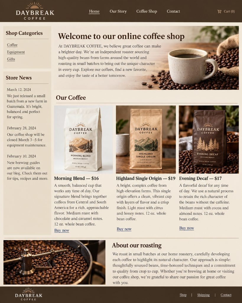
Daybreak Coffee original website, marked up with studio critique
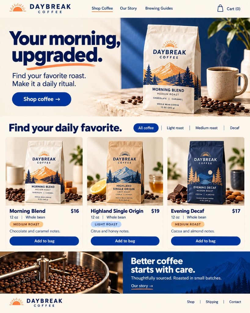
Daybreak Coffee redesigned concept

Concept exploration. The old site introduced itself and filed its coffee under categories. The concept sells instead: one line of want up top, filters that match how people actually shop, and bags that read like labels.

The Redline · No. 04

Nora Ellis Photography

A photographer filed by blog post and number.

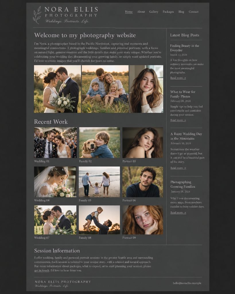
Nora Ellis Photography original website, marked up with studio critique
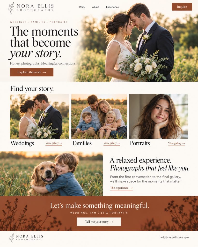
Nora Ellis Photography redesigned concept

Concept exploration. The old portfolio greeted, then filed the work by blog post and number. The concept leads with the story: galleries named for how clients think — weddings, families, portraits — and one warm ask at the end.

This is the critique the studio sends back — free, no call required. Request a Redline for your site →

Identity Work

Before the Business, the Mark.

Invented identities, each drawn from the name outward — the mark, the palette, and the letterforms built to earn their place together.

Hover a card. They like being picked up.

Mimblet identity concept: rounded purple and peach character mark with bubbly lowercase wordmark
mimbletfriendly without trying too hard
Orvessa identity concept: brush-stroke circular O above an elegant serif wordmark
Orvessaone stroke, unmistakable
Trovane identity concept: blue and red abstract T mark with wide geometric wordmark
Trovanetwo directions, one meeting point
Veltrove identity concept: gold V and T monogram with book spines on forest green
Veltrovequiet bookshop energy
Fizzelo identity concept: orange-fruit lowercase e with bubbles on mint green
fizzelofizzing before you read the name
Kordava identity concept: blue K formed with signal waves and stencil wordmark
Kordavathe K that sends a signal
Ellynd identity concept: interlaced navy and tan ribbon E with serif wordmark
Ellyndwoven, not pasted on
Vaskero identity concept: split black and red V inside a ring with italic wordmark
Vaskerosplit clean down the middle
Ruvella identity concept: calligraphic raspberry R with berry branch flourish
Ruvellagrown, not manufactured
Omvori identity concept: split black circle with one blue dot and rounded lowercase wordmark
omvorione blue dot earns its keep
Tessarik identity concept: geometric T in rust orange and lavender with rounded sans-serif wordmark
Tessariksplit four ways, still one letter
Lunquill identity concept: gold feather quill with crescent moon cutout on deep plum
Lunquilla quill that writes by moonlight
Ardovo identity concept: neon mint geometric bird-star mark on charcoal
Ardovoglows without trying
Velquora identity concept: split black and terracotta flame with elegant serif wordmark
Velquorathe Q earns its flourish
Pipparo identity concept: red fork winding pasta into the brand name on pale yellow
pipparothe name is literally the noodle
Quellora identity concept: bold eggplant Q with sweeping tail and wide-tracked serif wordmark
Quelloraquiet until you look twice
Zextrin identity concept: neon lime angular Z with X cutout on black
Zextrinloud and completely unbothered
Avelune identity concept: burgundy calligraphic A with looping crossbar and thin serif wordmark
Aveluneone line, going somewhere
Brontiq identity concept: terracotta geometric B with charcoal mechanical overlay and slab-serif wordmark
Brontiqmachinery with manners
Folun identity concept: black open-book mark with wing-like layered pages and geometric wordmark
Folunhalf book, half taking flight

The Next Project Here Could Be Yours

Every concept in this gallery started as a conversation about what a business needed. Let's have yours.

Start Your Project